


// The above image is from a bar called The Dock in Montauk, NY. Two quick points: 1) Shitfaced Monday is the best name for a single night in a bar I've ever heard, and 2) methinks the manager or owner who conceived this plan was practically encouraging the physical violence by gracing Monday with such a moniker.
// I've mentioned the UniWatch before. It's the "obsessive study of athletics aesthetics". The thing about UniWatch is its writer, Paul Lukas, expresses some of his views as fact. He'll have a link to a picture of a certain uniform and the actual link will just say "Ugh". Even when I agree with his view - like how stupid it is that a bunch of colleges just make their jersey colors into a Nike template, for example - I personally believe that it's dumb to judge without a preface of "this is my opinion", even if it's implied. Don't get me wrong; I love the site and I love Paul's attention to the nano-sized details, but sometimes he judges designs as if he's the lead guy on Project Runway. With that in mind, I was thinking that I'd like to write about the uniforms I like and the ones I hate. Actually, I have a lot of thoughts on both so I think I'll write about the bad uniforms another day. But hey, I also thought that an open discussion like "good/bad jerseys" could function like a shot in the arm for the comments section, which has seen less action than I did in the fall of 2006. Seriously. Worst slump ever. Let's hit it...
3) Michigan Football (Home) -- One of the worst parts about being an MSU football fan for the past 23 years - aside from the constantly underachieving teams, seemingly perpetual second-tier status, and borderline saboteur-esque coaching decisions on a weekly basis - is that the arch rival Wolverines have some dynamite niceties to go along with their sterling record on the field. The best example is their home uniform.
 I think a lot of people feel the same way about college football uniforms: the simpler, the better. More often than not, when a person is asked to rattle off some of their favorite college jerseys, the same names pop up: Penn State, Alabama, USC, Ohio State. Hardly anyone throws out Miami, Oregon, Northwestern. Michigan's simplicity works wonders, and at the same time the whole package is underscored by the helmet. What glory! It's just three stripes and two broad strokes of the brush, but it looks downright vicious, right? The design was founded in function: back when all helmets were leather (and the same color), Fritz Crisler brought over the winged design from his days at Princeton, where he thought it up. The quarterback was better able to identify his receivers downfield. I wonder if Crisler put it on the hats purely as a functional tool. Do you think he even realized how cool it looked back then? Regardless, this uniform is (begrudgingly) my favorite uniform in college football. My saving grace: Michigan State has adopted (under Mark Dantonio, who will go down as the George Washington to U of M's British Empire) a much cleaner, simpler look that harkens back to their 1950-70 glory days. That, combined with Rich Rodriguez's touch of death (partially covered in an earlier post), will lead my boys back to the promised land. Suck it.
2) Chicago Bulls -- The fact has slipped past me until I really thought about it and wrote it down: two of my favorite three uniforms belong to big, big rivals of two teams I root for. Why Chicago? Well, it's a combination of things. Part of the allure is their primary logo, which they've held for their entire stay in the Windy City.
 I'm nothing if not a sucker for continuity. Plus, the bull is a great example of how to make an animal look mean without going today's route, which is making the animal look like it's been using steroids. That is a giant pet peeve of mine. That, and giving an animal logo a set of teeth when the actual animal depicted doesn't have teeth. Effin' A. Getting back to the point, non-roid-raging-but-still-mean-looking bull is something I appreciate. Also, check out the neckline. It's a classic neckline. Some time ago, for reasons I doubt I'll ever understand, the NBA and Reebok decided the neckline on the uniforms was outdated. I don't know if the players complained about the neckline during timeouts or what, but the effect was widespread: we were all treated to new, some would say dumber necklines. Aside from very few others, the Bulls held strong and maintained the classic neckline. I like that. Lastly, I like the black & red color scheme. You know when teams decide to field an alternate uniform, but a lot of the time it's just the same uniform except black (ahem, Detroit Lions)? I don't care for that look. See, the Bulls actually have black as a primary part of their regular color scheme, so I give them a pass.
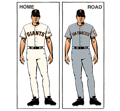
1) San Francisco Giants -- Kind of like the general "all-time favorite song" category, I've switched my #1 ranking from time to time, but the Giants uniforms have held onto the top spot for quite a while. Where to begin?
 For starters, the primary logo. Interlocking letters are such a plus, yet they're so subtle that they often go overlooked. If a good uniform is akin to a hot Reuben sandwich, then the use of interlocking letters is like a garlic-soaked Kosher pickle on the side. Do you absolutely need it? Nah. But does the whole experience taste that much better when it's there? You bet your sweet, juicy ass. Added bonus: "F" and "S" are the two letters that start two great cuss words. That provides a great benefit to Giants fans if they're ever bored at a game (read: every single game not pitched by Tim Lincecum). Switching gears from rambling to stuff that makes sense, let's talk about orange and black as a color scheme. Orange and black is perhaps most closely associated with Halloween. Rightly so, I might add. However, the color scheme is so underused, underrated, and generally relegated to afterthought that the few teams that do use it (Giants, Flyers, Bengals, Orioles, Oregon State) tend to stand out amongst the more generic schemes. Plus, who doesn't remember Halloween with fond memories? Add to that the gorgeous typeface they use, and you're looking at a mighty fine get-up to play some ball in. Kudos to the S.F. Giants. They may make awful trades that eventually end up making the other teams in the Tigers' division better, but damn if they don't have what I consider to be the best uniform in sports.
 // Well, that's it for the week. 1 post. I'm like the Cal Ripken of blogging. And by Cal Ripken, I mean Carl Pavano. Late!
1 comment :
Gonna have to disagree with you there Mike. The interlocking letters is the most uncreative and stupid logo in sports (see: Grosse Ile). Seriously though, it requires no innovation or artistic ability to create, it's just 2 freaking letters. Weak...
Post a Comment